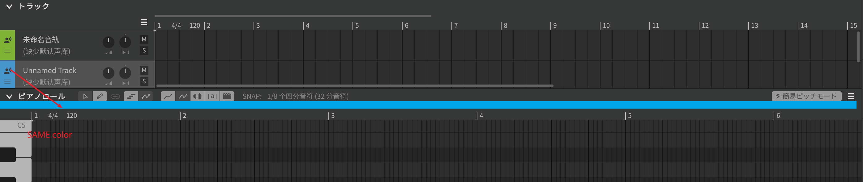
When you change the color of a track, it would be nice if the color of the notes on the piano roll would also change. There are times when I want to change the harmony track, but I accidentally edit the notes of the main part. This can be prevented if I am careful, but I need to be careful.
(DeepL)
I want to bump this as I’ve seen a few other users mention the fact that track colour/color and note colours/colors do not match. It does make editing that much more difficult - I have also edited a whole vocal part thinking it was a different track only to find out I was changing the wrong voice
Is there a process to upvote functionality requests so the developers can prioritize them?
This suggestion is non-sense and ridiculous
The color for note should keep stable through editing (for example, in one theme, the programmers want to see all int tokens in ONE color, wherever the file in), so the color of note should NEVER change.
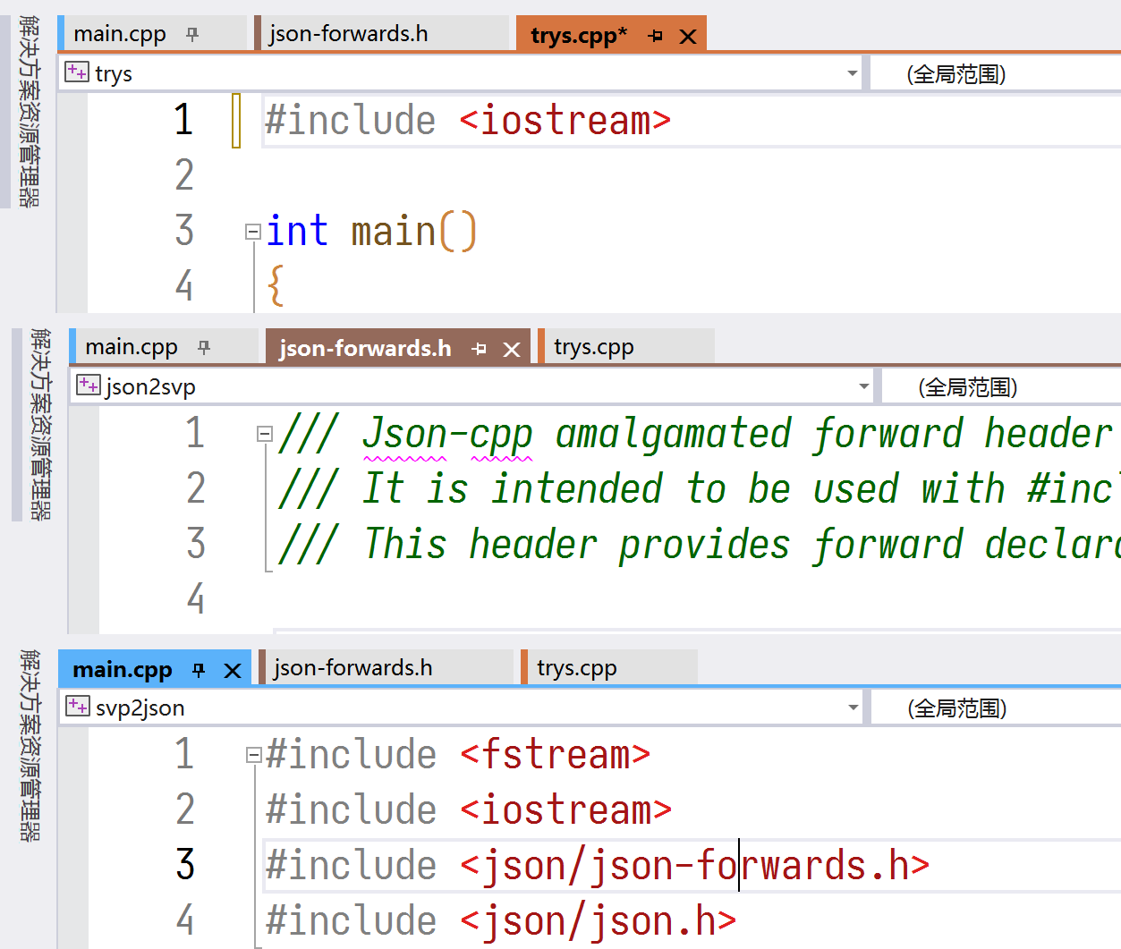
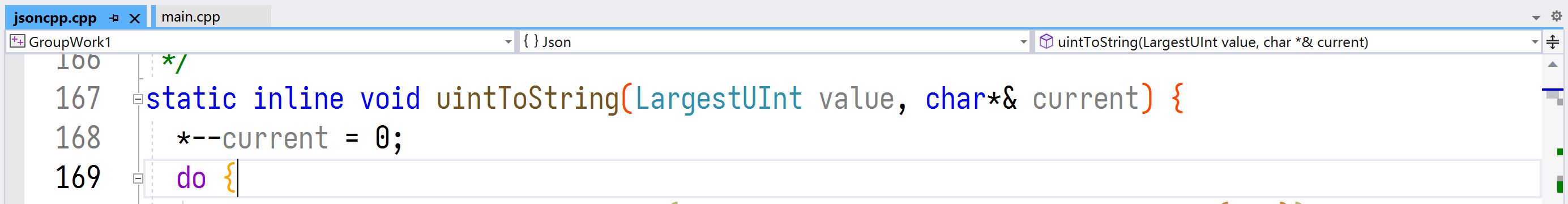
BUT, the Visual Studio does provide a option to show different color in different projects (similar to different tracks in SV), let me show you a screenshot.
Sorry but this is not a non-sense or ridiculous suggestion it’s just another way to manage work flow.
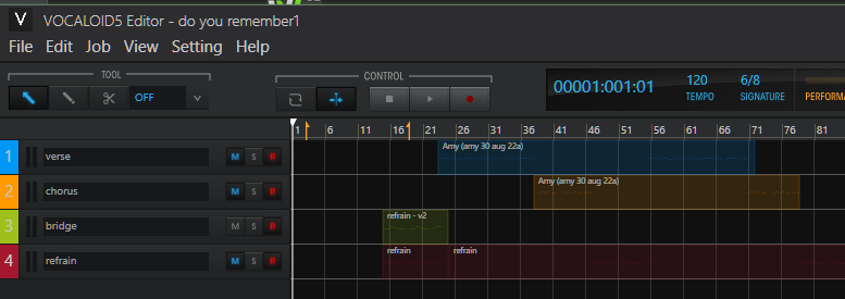
It’s a feature already implemented in Vocaloid and means you can switch between multiple views with almost zero risk of editing the wrong part eg:
The main view shows each track as a separate, user selected colour (my main vox are always blue, chorus orange etc)
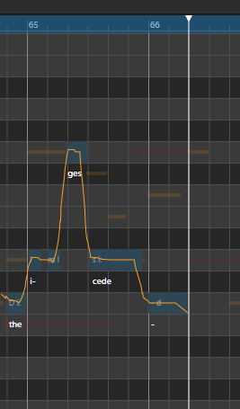
Seeing as the current beta has colored notes (based on pitch mode rather than track number) this might be the best opportunity to send your feedback to Dreamtonics.
I’d suggest sending an email to [email protected], specifically mentioning note color feedback and linking to this forum thread.
In a departure from previous releases where all notes are displayed in the Synthesizer V theme color, we are experimenting with a feature that assigns distinct colors to notes under Manual, Sing, and Rap modes. We encourage you to share your feedback on whether this color scheme provides effective visual differentiation or proves to be distracting, as we continually strive to improve the user experience.
I do agree that notes may have different “kinds” that must be highlighted while editing, but the change of color is too huge and un-continuous, while, in my point of view, a top-bar is better
In my point of view, SV editor didn’t make full use of top-bar. The indicator in VS shows the class, namespace and other infomation, but SV just use it to show a simple time line. I think a top-bar should be added to show the basic attributes of note/note group and track, and leave all notes to share the same color in main editor.
This is why, where possible, it would be best for any sort of changes to be customizable.
When it comes to UI improvements you’ll rarely please everyone, especially if you take something away in the process of adding something new without it being a clear improvement. Allowing users to toggle between options or even fully customize the color scheme would be the most appropriate step forward, because it would enable users who want more color-coding without interfering with users who like things as they are and would find that distracting.
Some people are bound to prefer things the way they are, but that doesn’t mean it’s nonsensical for others to have issues with the current color scheme. There’s no “one-size-fits-all” when it comes to UX.